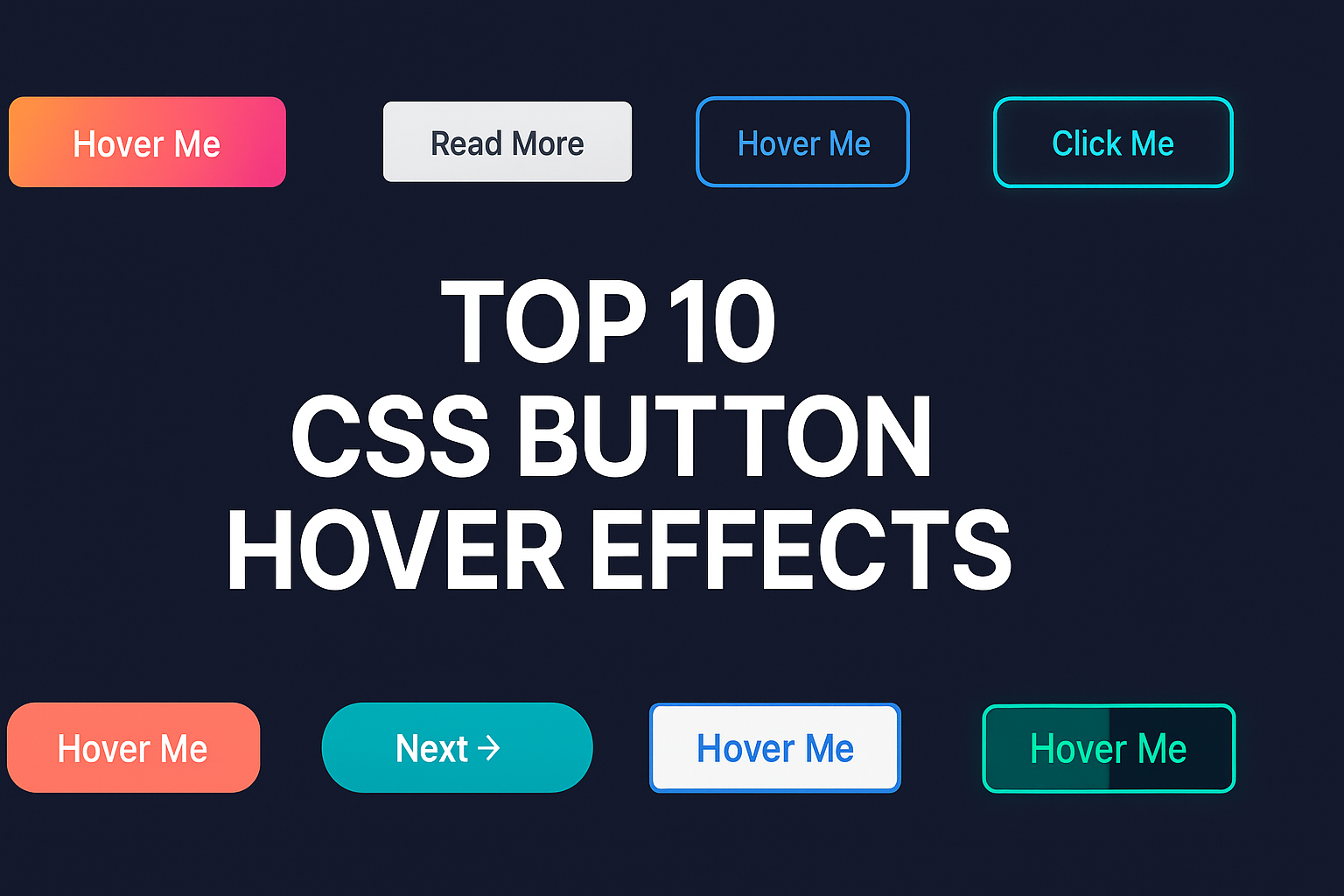
Top 10 CSS Button Hover Effects You Can Copy and Use
Buttons are one of the most clicked and noticed UI elements on any website. They’re not just functional - they define your design’s style and interactivity.
A well-designed button with a smooth hover effect can improve user experience, encourage clicks, and make your UI feel more polished and modern.
In this article, we’ll explore 10 creative CSS button hover effects that you can copy and use directly in your next project. All examples use pure HTML and CSS, no JavaScript required - fully compatible with your MyUIHub components library.
Let’s dive in 👇
🎨 Top 10 CSS Button Hover Effects
1️⃣ Gradient Color Shift on Hover
A timeless and elegant effect - the button’s gradient background changes when hovered.
HTML:
<button class="btn-gradient">Hover Me</button>
CSS:
.btn-gradient { background: linear-gradient(90deg, #ff7a18, #af002d 70%); color: #fff; border: none; padding: 12px 30px; border-radius: 8px; transition: 0.4s; } .btn-gradient:hover { background: linear-gradient(90deg, #af002d, #ff7a18 70%); }
✨ Why it works: Eye-catching, modern, and visually dynamic.
2️⃣ Underline Slide Animation
A minimal button where an underline smoothly slides in from left to right.
HTML:
<a href="#" class="btn-underline">Read More</a>
CSS:
.btn-underline { position: relative; color: #333; text-decoration: none; padding: 10px 0; } .btn-underline::after { content: ""; position: absolute; width: 0; height: 2px; left: 0; bottom: 0; background-color: #333; transition: width 0.3s; } .btn-underline:hover::after { width: 100%; }
✨ Why it works: Simple yet stylish - perfect for navigation menus.
3️⃣ Outline Expand Effect
The button’s border expands outward with a smooth animation.
HTML:
<button class="btn-outline">Hover Me</button>
CSS:
.btn-outline { border: 2px solid #007bff; color: #007bff; padding: 10px 25px; border-radius: 6px; background: transparent; transition: all 0.3s ease; } .btn-outline:hover { background: #007bff; color: #fff; box-shadow: 0 0 10px rgba(0, 123, 255, 0.6); }
✨ Why it works: Great for call-to-action buttons.
4️⃣ Glow on Hover
Perfect for futuristic or tech-style designs.
HTML:
<button class="btn-glow">Click Me</button>
CSS:
.btn-glow { background: #111; color: #fff; border: 2px solid #00e0ff; padding: 12px 25px; border-radius: 8px; transition: 0.3s; } .btn-glow:hover { box-shadow: 0 0 15px #00e0ff, 0 0 30px #00e0ff; }
✨ Why it works: Adds futuristic appeal with minimal effort.
5️⃣ Shadow Lift Effect
Gives a feeling that the button “lifts up” when hovered.
HTML:
<button class="btn-lift">Hover Me</button>
CSS:
.btn-lift { background: #ff6f61; color: white; border: none; padding: 14px 32px; border-radius: 6px; box-shadow: 0 4px 6px rgba(0,0,0,0.1); transition: 0.3s ease; } .btn-lift:hover { transform: translateY(-5px); box-shadow: 0 8px 12px rgba(0,0,0,0.2); }
✨ Why it works: Adds subtle interactivity without overdoing it.
6️⃣ Background Slide Animation
Background color slides from left to right on hover.
HTML:
<button class="btn-slide">Hover Me</button>
CSS:
.btn-slide { position: relative; overflow: hidden; color: #fff; background: #0077b6; padding: 12px 28px; border: none; border-radius: 6px; transition: color 0.3s; } .btn-slide::before { content: ""; position: absolute; left: -100%; top: 0; width: 100%; height: 100%; background: #00b4d8; transition: all 0.4s; z-index: 0; } .btn-slide:hover::before { left: 0; } .btn-slide:hover { color: #fff; }
✨ Why it works: Eye-catching and smooth for call-to-actions.
7️⃣ Icon Move Effect
An icon smoothly slides when hovered.
HTML:
<button class="btn-icon">Next →</button>
CSS:
.btn-icon { border: none; color: white; background: #00adb5; padding: 12px 25px; border-radius: 6px; transition: 0.3s ease; } .btn-icon:hover { transform: translateX(6px); }
✨ Why it works: Great for buttons like “Next”, “Continue”, or “Send”.
8️⃣ Text Color Swap
Text and background color swap dynamically.
HTML:
<button class="btn-swap">Hover Me</button>
CSS:
.btn-swap { background: white; color: #0077b6; border: 2px solid #0077b6; padding: 10px 28px; border-radius: 6px; transition: 0.3s ease; } .btn-swap:hover { background: #0077b6; color: white; }
✨ Why it works: Classic, simple, and versatile for any design.
9️⃣ Split Color Fill
Color fills half of the button from left to right on hover.
HTML:
<button class="btn-split">Hover Me</button>
CSS:
.btn-split { background: linear-gradient(to right, #219ebc 50%, #023047 50%); background-size: 200% 100%; background-position: right bottom; color: white; border: none; padding: 12px 32px; border-radius: 6px; transition: background-position 0.4s ease; } .btn-split:hover { background-position: left bottom; }
✨ Why it works: Bold, modern, and energetic.
🔟 Border Glow Pulse
Creates a soft glowing pulse around the button.
HTML:
<button class="btn-pulse">Hover Me</button>
CSS:
.btn-pulse { background: #0f2027; color: #fff; border: 2px solid #00e676; padding: 12px 28px; border-radius: 8px; transition: 0.4s; } .btn-pulse:hover { box-shadow: 0 0 10px #00e676, 0 0 20px #00e676; }
✨ Why it works: Subtle motion draws attention naturally.
✅ Final Thoughts
Button hover effects may look small, but they make your UI feel alive, responsive, and polished.
These 10 free CSS button effects can be used across landing pages, portfolios, blogs, and SaaS apps.
For more such free, ready-to-use UI components - explore the full Button Components Collection on MyUIHub 🎨
You’ll find gradient buttons, animated CTA styles, and responsive designs - all built with pure HTML & CSS, and free to copy, modify, and use!
Frequently Asked Questions(FAQs):
1. What is a button hover effect?
A hover effect is a visual change when a user moves the cursor over a button - like color shifts, shadows, or animations.
2. Do hover effects affect website speed?
No - pure CSS effects are lightweight and won’t slow your site.
3. Can I use these effects with frameworks like React or Tailwind?
Yes, you can copy the CSS class into your component and reuse it easily.
4. Are these hover effects mobile-friendly?
Yes, though touch devices don’t “hover,” they still show active styles.
5. Can I change the button colors?
Absolutely! You can customize gradients, borders, and shadows by editing the CSS variables.
CSS button effects
hover animation
HTML CSS buttons
UI components
front-end design
MyUIHub
CSS tutorials
web development
.png)
.png)
.png)